This article collects information regarding the conceptualisation of the gameplay of The Mana World
This article has the following gaps:
- What kinds of items can be equipped?
- What are the conditions for equipping items?
- What effects do equipment pieces have on the wearer?
The following parts of this article are disputed in the development team:
Which of the two systems described below should be used? Or should we create anotherone from scratch?
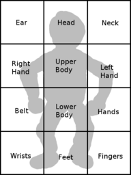
Player equipment slots
| Part of body | Item type |
|---|---|
| Head | Helmet, crown, hat, etc. |
| Ear | Earring |
| Neck | Necklace, amulet, muffler, scarf |
| Upper body | Sweater |
| Belt | Waist |
| Lower body | Trousers |
| Feet | Shoes, boots |
| Left hand | Weapon/shield |
| Right hand | Weapon/shield |
| Hands | Gloves, gauntlets |
| Wrist | Bracelet |
| Finger | Ring |
The above list features 12 equipments slots. 4 of these are jewelry, with 1 slot for necklace, 1 for bracelet, 1 for a ring and 1 for an earring. The two hands work together and are used for a one handed weapon with shield, a two handed weapon, or a projectile weapon with ammo.
- Other options have been discussed to allow 2, 4 or even 10 rings. Possibly that would also mean 2 bracelets and 2 earrings. Personally I think we're getting too much jewelry that way. This would make equipping more complicated as the player would need to choose which slot to unequip from (while otherwise slot can be selected automatically, as it is now). Also it would mean we can't make jewelry very powerful as a player can wear so many of it. --Bjørn 15:35, 2 Jul 2005 (PDT)
- I guess 4 slots for jewelry is enough also for a king. And I was also thinking that maybe it could be better not to show every equipment, such as earrings, they will probably be barely visible and not worth it. I guess we will evaluate this matter as soon as it will be necessary. --ElvenProgrammer 02:41, 3 Jul 2005 (PDT)
A variation on a theme
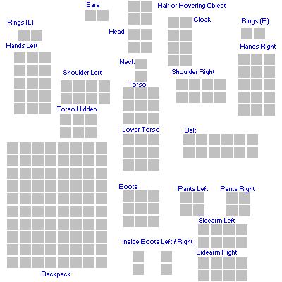
Seems to be a familiar design, but it's always been realistic enough for me. A larger bag would have more grid-space than a smaller bag; smaller items would fit appropriately in comparison to larger items.. it's all pretty simple. It's just a question of opinion in gaming style. Do we simply want to pay attention to the weight and quantity of items, or do we want to pay attention to each item's size, as well? It's just another level of restriction that is there to implement, if we feel like it.
Additional slots
There will be at least one additional slot that cannot be altered by the player directly, which will contain the player's hair. An additional slot for the player face is also discussed.
Altering player appearance
Any of these items will be able to alter the appearance of the player. For the engine to be able to determine the order in which to draw the equipment on the player, each slot has an associated xOrder and yOrder value. The yOrder determines the height: the higher the yOrder, the later the equipment will be drawn. The xOrder determines whether the item is to the left or right of the middle, and is used when the player faces sideways. A negative value means right where a positive value means left.
Having multiple boxes for items makes the coding more difficult, I suspect that's why WoW decided to drop it. Weight can be a restriction, I think multiple boxes is just irritating. I remember in muOnline, which uses multibox system, I would have spent considerable time re-arranging the slots , just so I could fit larger items in, and if u didn't have the right free size then u couldn't pickup items, not to mention that auto placing picked up, can't sort the grid out nicely, so u get a nice jumbled mess.
Multiple use equipment
Since we are working off of a system plan that doesn't include character levels, the question is bound to come up sooner or later: "What if a new player can just strap on the ultimate armor and kill monsters 5 times his level with ease?" I think I have a solution to this:
Each equipment item would have a list of bonuses, each with a condition attached. See the following example:
- Vampire Cape
- (No condition) Defense + 12
- (Dark Magic Skill 50+) Absorb Dark Magic
- (Vitality Skill 30+) HP drain 20% effect on attacks
- (Vitality Skill 30+) Halt skill growth - Vitality
So equipping the vampire cape would give any player +12 defense. Also, if his dark magic skill is high, it allows him to absorb dark magic. If he has a high enough HP, he is able to drain HP with attacks, however, his HP skill cannot increase as long as he wears the cape. In this way, we can reserve powerful equipment effects for experienced players, or at least only for players with certain specialties.
That sounds nice, but I have to think of an ElvenCloak. This piece of "armor" stealthes characters and what if we had one ingame and a lv10(expl) Player gets one as a gift/reward and he can't use the benefits? I think armor has a special power of its own, and equipment doesn't "decide" who is worthy of its protection. That includes things like absorption, missile deflection, better movement, maybe skill increase(expl gloves), etc. But maybe a character that is a skilled fighter(~) can use a good cape to catch arrows. Vamp. Cape's Absorb: That would be determined by the material/structure of the cape itself. But again a player that is experienced with dark magic could use it better and absorb even more. That leads me to a thought that this is Player related. A dark magician could possibly absorb b.mag. on his own.
Anyway, those were just ideas...
- I think the system presented above will allow for the things you describe, right? I think the system is fine, you seem more concerned about how we're going to use it. --Bjørn 13:03, 30 Jul 2005 (CEST)
- Why don't we give items percentual boni instead of absolute boni? A glove which increases strength by 10% would be as useful for a newbie as it is for a high level char. --Crush 20:47, 12 Sep 2005 (CEST)
- I believe I have answered this before elsewhere, but in the sense of healing potions that heal using percentages. I think it won't really work because it would remove part of the need to find better items, which is actually part of the fun. --Bjørn 12:36, 13 Sep 2005 (CEST)
Item Client Interface Proposal
Preface
We will need to clarify a few terms to improve clarity within this section.
A reference to the Equipment window – will now encompass elements of the old Equipment window, and the Inventory window, plus new features.
The old 'Equipment Window' will now be considered part of the 'Equip section' of the equipment window.
Functionality that was previously contained in inventory window, will now be considered the 'Backpack' of the equipment window.
Overview
This document describes and outlines the changes and specifications that will be required to create the Item interface system. This system is not stand-alone, and is integrated, so some overlapping may occur when it comes to documenting the interaction with other inter-connected systems.
A total gui re-design will be required from the ground up, to support the slot based system.
Guidelines
Some additional goals are listed here.
The interface should be made to work with a minimum of a one Button Mouse and keyboard.
Every attempt should be made to ensure that a user can use just a Keyboard or Joypad, without the need for a mouse.
Functionality
Keyboard/Joypad requirements
The following will be required, to be able to use the full functionality of the Equipment window.
| Required Keys | |
|---|---|
| Keyboard | Joypad |
| Arrow Keys | Directional Pad |
| Select Key | Select Button |
| Context Key | Context Button |
Keyboard shortcuts
Their should be some shortcuts to switch between various sections. The spot at which the highlight cursor left off should be remembered, so if the user switches back than they can resume where they left off.
Additionally, they should be made configurable.
| Function | Default Value |
|---|---|
| Switch to Backpack section | B |
| Switch to Equip section | E |
Selecting Items
When an item is selected, the description and the effect should appear in a dedicated section.
Visual Cues
The Buttons should be replaced with standardized graphical icons, instead of just labels, to lessen the language barrier.
When an item is selected the bounding rectangle will turn a prominent colour (likely red).
Mouse
When an item is selected and the cursor moves from the item, the item icon will appear underneath the cursor. When the user selects it's context then it will dissapear.
Keyboard / Joypad
When navigating items, a bounding rectangle will follow (likely orange).
Actions
Here are the actions that can be taken with the items both in the backpack and the equip section.
| Action | Mouse | Keyboard / Joypad |
|---|---|---|
| Navigate items. |
|
|
| Select Item. |
|
|
| Un-select Item. |
|
|
| Use/Equip/Un-Equip Selected Item. |
|
|
| Move an item. |
|
|
| Drop Item. |
|
|
| Open context Menu. |
|
|
Actions that are specific to the backpack section.
| Action | Mouse | Keyboard / Joypad |
|---|---|---|
| Split Item. |
|
|
Context Item Menu
Here is the context menu options on a selected item.
| Backpack Section |
|---|
| Use/Equip. |
| Drop. |
| Split. |
| Equip Section |
|---|
| Un-Equip. |
| Drop. |
Moving Items
The user should be able to click or select various sections on the interface which will indicate what to do with the item that's been selected.
Note - The user should have the ability to unselect an item in any area by doing a un-select, in the equipment window, and areas that are listed below.
| Area | Function |
|---|---|
| Use/Equip/Un-Equip Button | Use/Equip/Un-Equip Item. |
| Drop Button | Drop Item |
| Split Button | Split Item. |
| Equip area | Assign to correct slot. |
| Backpack area | Move item to next free slot. |
| Viewport area | Drop Item. |
| Shortcut area | Assign shortcut to item. |
| Item Slot - Empty | Move Item to empty slot. |
Split Function
Still in it's concept phase. My suggestion is that when the function is selected, a dialog will show. It will have a scroll bar, and a text input to directly enter in the amount.
It will validate the amount entered before proceeding.
When the amount has been input and validated, the item will remain selected. The user navigates to the empty slot that they wish to place the allocated amount, and select it.
This effect would be similar to a move, except that the remaining amount will stay in the initial selected slot and the speciified amount in the new empty slot.
See also
- Synthesis - Upgrading your items - See Equipment upgradability
- Get Equipped - See the Master equipment list and add to it!

