From The Mana World
m |
m |
||
| Line 39: | Line 39: | ||
*[http://www.natomic.com/hosted/marks/mpat/ Mark's Pixel Art Tutorial] | *[http://www.natomic.com/hosted/marks/mpat/ Mark's Pixel Art Tutorial] | ||
*[http://derekyu.com/extras/pixel01.html Derek Yu's Pixel Art Tutorial] | *[http://derekyu.com/extras/pixel01.html Derek Yu's Pixel Art Tutorial] | ||
*[http://http://www.spriteart.com/main.html | *[http://http://www.spriteart.com/main.html Great st0ven's site] | ||
*others : [http://www.pixel-arts.org/pixelation/index.php?topic=222.0], [http://www.pixeljoint.com/pixels/links.asp?id=2192], [http://pixel-zone.rpgdx.net/shtml/tutorials.shtml]. | *others : [http://www.pixel-arts.org/pixelation/index.php?topic=222.0], [http://www.pixeljoint.com/pixels/links.asp?id=2192], [http://pixel-zone.rpgdx.net/shtml/tutorials.shtml]. | ||
Revision as of 00:37, 26 January 2007
In general
- Don't be afraid to show us your unfinished pieces, we are there to guide and help you through the process.
- If possible, hang around the #tmwart channel on irc.freenode.net 24/7.
- When you're available / doing work on tmw related stuff, please contact me on the previously mentioned channel.
- We're soon going to have a centralized repository for all the art related stuff where we're going to archive all of your versions, so you can just start to contribute there without the need to track down a dev. The details on the repository and the preferred version numbering are coming soon. EDIT(20050419): Ask me for details, it's up now.
- Preferred formats: .png and .ogg
Concerning conceptual art
- You can always come up with new ideas to present to the team. Actually that's preferred and we like that.
- With conceptual art you might want to define important places, capture the generic atmosphere, look, and color scheme of a certain place or define the looks of an important NPC.
Concerning tiles
- We REALLY need a LOT of these, so if you think you can do ANYTHING, please give it a shot.
- Especially on these actively seek out our attention so we can assign new tasks to you. The fact that we won't contact you personally every day doesn't mean we don't need your efforts.
- You can find the technical specifications of tilesets here: Tileset development
- Please keep in mind that a mapper has got only 3 layers: 2 of them are always displayed below players and monsters while the other one is displayed always above. The lowest layer is usually used for ground tiles/walls, and since the limited number of layers, ground tiles should be non-transparent even if this increase a lot the number of tiles in a tileset. Transparent tiles should be only used for objects you can place in different places with different backgrounds such as plants, barrels, ... It is preferrable that cups, and food and whatever else stands on a table is drawn with the table tile below it. Paintings shouldn't have transparent borders, but wall behind them. (if you plan to use for example paintings in different tileset, save them elsewhere as transparent objects and then reapply them to another tile).
- Although we prefer high quality tiles over low quality ones, please keep in mind that we try to resemble the look of old SNES games. So please try not to make the tiles too realistic. This mean please don't use textures you get from reality, such a picture of a wooden piece and use it for your tiles. We strongly encourage you to manually pixelate every tile and avoid to use gradients or filters such as blur too excessive.
- All the tileset should use some coherence:
- Light direction: south-west for outdoor tilesets (of course there will be exceptions: different (or special) areas could have a different direction of light to give it a subtle different feeling, such as lava caves with subtle orange light from the bottom, and deep in the dark forest with glowing mushrooms), diffuse light for indoor tilesets diffused light is nice, but overusage could lead into problems with contrast between the inside and the outside.
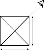
- Perspective: top-down 45° view angle (see the schematic to the right, the thick gray line is the length with which the side and bottom are perceived, a factor of 0.7 smaller).
- Proportions: a character is approximately one tile wide and two tiles high.
- Color style: try to use the same color palette for the whole tileset. the selection of color is important for the feeling of the tileset. weak colors with a high amount of grey for example are good for a sad and cold feeling while bright colors create a happy and warm atmosphere. whatever atmosphere you choose: it should be consistent through the whole tileset. avoid using weird "alien" colors (keep saturation low :P).
- Drop shadows: large objects on outdoor tilesets (like buildings, for example) should have drop shadows cast to the northeast. The shadows should be pure black with an opacity of 30%. the edges of the shadows should only have an opacity of 15%.
- Reuse: The tiles in one tileset should be able to be put together in as many different ways as possible to allow the mapper to express his creativity. This is the base requirement for:
- Borders between different heights: http://www.enterbrain.co.jp/digifami/digiweb/dot_teck/3nen/05/8.gif
- Fences http://www.enterbrain.co.jp/digifami/digiweb/dot_teck/3nen/04/053.gif http://www.enterbrain.co.jp/digifami/digiweb/dot_teck/3nen/04/052.gif http://www.enterbrain.co.jp/digifami/digiweb/dot_teck/3nen/04/054.gif
(please note that the above pictures are only for demonstrational purpose. they are copyrighted and not part of the mana world project).
Tutorials
When you are not very experienced at creating pixel art, you should take a look at the following tutorials. You can learn many interesting tricks from them.
- So You Want To Be A Pixel Artist by Tsugumo. (more recent version [1])
- Enterbrains Tutorial (translated from Japanese by Google). all the above images have been taken from this tutorial.
- Mark's Pixel Art Tutorial
- Derek Yu's Pixel Art Tutorial
- Great st0ven's site
- others : [2], [3], [4].
