m (Added "voting" banner.) |
m (Jaxad0127 moved page Picto-language to Archive:Picto-language without leaving a redirect) |
(No difference)
| |
Latest revision as of 21:21, 1 July 2013
This article is currently only a proposal
The features or design guidelines described in this article are only a proposal made by one or some persons. It has not been evaluated or accepted by the core development team yet. Feel free to add your personal opinion about them or make counter proposals.
| People who approve this proposal | People who oppose this proposal |
|---|---|
|
|
What's a Picto-language
In short a picto-language is a language not composed of abstract symbols but of more easily recognisable pictographs such as is used in rebuses. Hieroglyphs would be a good example of a picto-language, though one that through evolution uses a lot of abstract symbolism as well, making it hard to guess the meaning from the symbols only. For a game I would suggest a more simple, childlike, form of pictographs without abstract symbols , replacing them with clearer ones.
Why a Picto-language
The idea of a picto-language is to have an in-game language for:
- Hints that are not given by NPC. (like how to open a massive door without a key, in a particular dungeon)
- Secrets. (scattered graffiti may point to some mighty interesting secrets)
- Easter Egg Text. (Text left by the makers, such as funny remarks or jokes, but transcribed to a picto-language)
What should a Picto-language be like
Pictographs for a picto-language should be:
- easily discernible so they can be recognised in the background graphics.
- stylish. This sounds unimportant, but it is. A scruffy looking picto-language such as my examples wouldn't do.
- have multiple interpretations. A picto-language should leave room for mis-interpretation, which makes it more challenging to decipher one correctly.
- tested for comprehensibility. Ie: sentences should be tested out, those who's meaning are easily understood constitute easy hints or secrets. Those that are vague and very ambiguous would constitute hard hints, or real secrets.
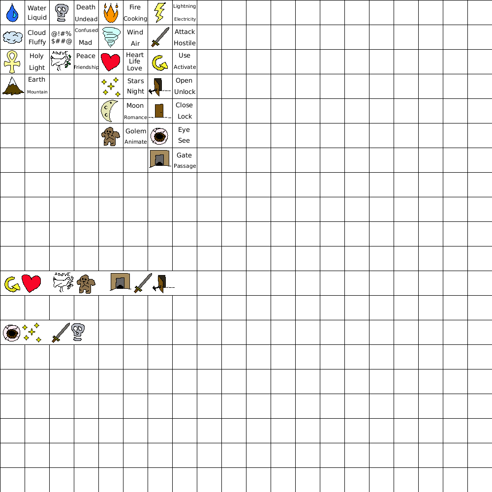
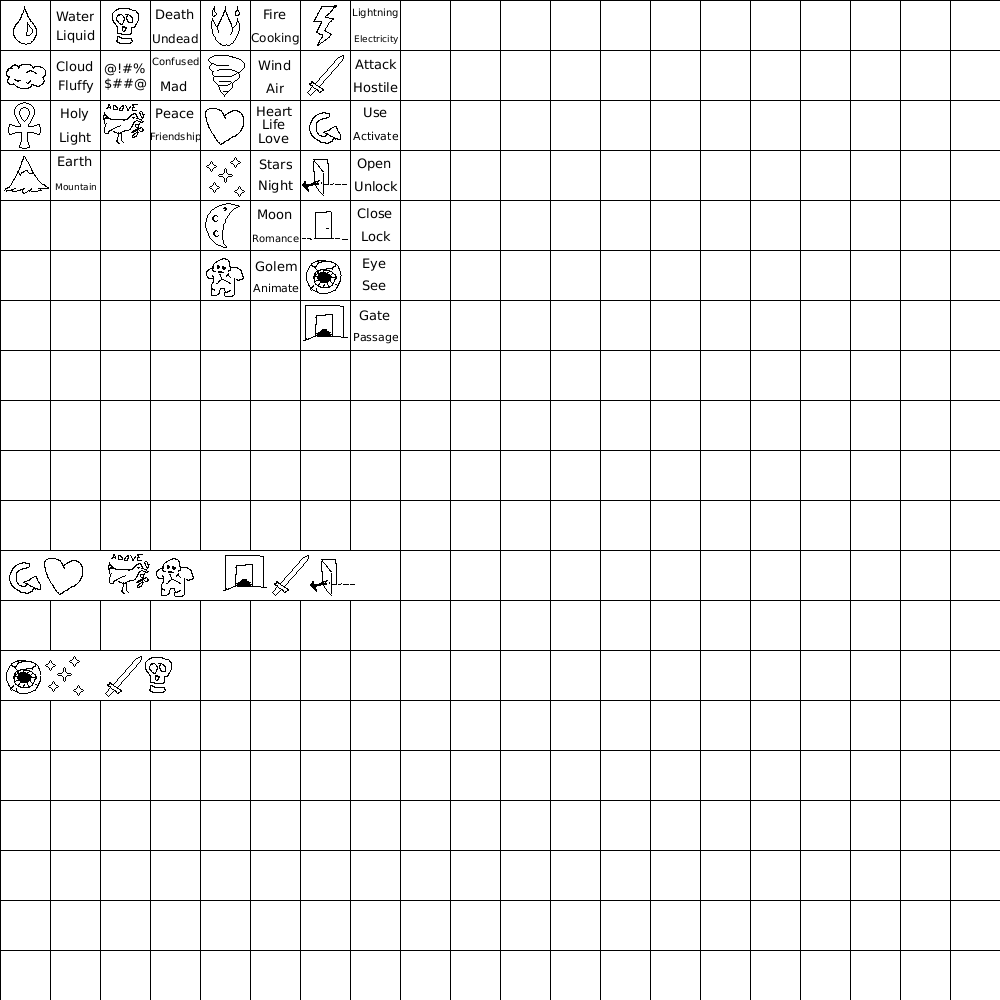
Ideally the pictographs should be coloured in. This makes them stand out more against a already richly coloured background. Just having the outlines would make them hard to read, not unlike tmw 0.0.13's float text over a brick floor.
Picto-language examples
Here follows a quick example (in both colour and monochrome), including 2 sentences I leave to readers to decipher.

