m (Jaxad0127 moved page Tileset development to Dev:Tilesets) |
m (Move page script moved page Dev:Tilesets to Development:Tilesets: Rename Dev: to Development: so the miraheze import works) |
||
| (3 intermediate revisions by 2 users not shown) | |||
| Line 1: | Line 1: | ||
{{Category_art}} | {{Category_art}} | ||
{{Status_green}} | {{Status_green}} | ||
{{Status Under Construction}} | |||
== Getting started == | == Getting started == | ||
| Line 38: | Line 39: | ||
Feel free to ask that question on IRC: | Feel free to ask that question on IRC: | ||
irc://chat.freenode.net/themanaworld-dev | irc://chat.freenode.net/themanaworld-dev | ||
[[Category:Development]] | |||
Latest revision as of 03:56, 27 March 2024
This article contains information for Artists working or interested in working for The Mana World
This article is for reference purpose
The features described in this article are already implemented in the game. The article should describe how a certain aspect of the game currently works. You may of course edit this article to improve the description of the circumstances. Your opinions or improvement suggestions about the described aspects themself are of course appreciated, too. But please put these on the discussion page of this article to keep facts and fiction separated.
Getting started
To get started on tileset development, please look into what kind of areas we plan to add to the game or what kind of changes we would still want to make to existing maps. See for example Geography and concept art. Ideas of your own are welcome too!
General specifications
- Tile size: 32x32
- Tileset size: Width: 512, Max height: 512 (for 1x1 sets)
- Color Depth: 24 or 32 (alpha layer optional, no magic colors)
- File Format: PNG
- Current tilesets: https://github.com/themanaworld/tmwa-client-data/tree/master/graphics/tiles
Please also note our style guidelines.
Guidelines
- Please keep in mind how maps are made (see Map development). The lowest layer is usually used for ground tiles/walls.
- Although we prefer high quality tiles over low quality ones, please keep in mind that we try to resemble the look of old SNES games. So please try not to make the tiles too realistic. Please don't use realistic textures, such as a photo of a wooden piece, and use it for your tiles. We strongly encourage you to manually pixelate every tile and avoid to use gradients or filters (such as blur) excessively.
- Regarding color choice: Keep your color palette narrow. Don't use more shades per color than necessary. 3 shades of one color are usually enough for small objects. Even very large objects shouldn't use more than 5 or 7 shades. But how many shades you use is in the end left up to the artists discretion. Keep in mind that dithering is usually used for structure effects in TMW and rarely for blending one color into another. When a structure effect is not needed you shoud better add an additional shade instead of applying too much dithering just for color blending.
- Try to use the same color palette for the whole tileset. The selection of color is important for the feeling of the tileset. Cold colors with a low saturation are good for a sad and cold feeling for example while warm and saturated colors create a warm and cheerful atmosphere (but please don't overdo the saturation). Whatever atmosphere you choose, it should be consistent through the whole tileset. When you create new tiles for existing tilesets you should try to use only colors that are already used in the tileset. Otherwise your new tiles will stand out and look weird when next to the old tiles.
- Visible outlines are reserved for sprites. Please avoid them when creating map tiles.
- The light direction is south-west for outdoor tilesets. Imagine the light source to be over your left shoulder. Of course there can be exceptions to this rule. Different or special areas may have a different direction of light to give it a subtle different feeling, such as lava caves with subtle orange light from the bottom, and deep in the dark forest with glowing mushrooms. For indoor tilesets diffused light is nice, but overusage could lead into problems with contrast between the inside and the outside.
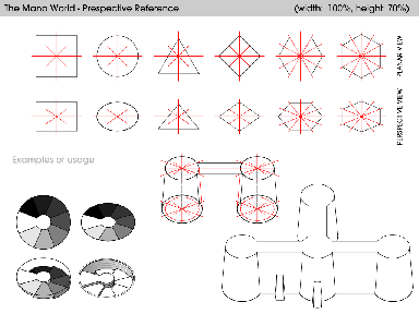
- Perspective: top-down 45° view angle (see the schematic to the right). SVG version: TMW-PerspectiveReference.svg
- Proportions: A character is approximately one tile wide and two tiles high. Don't be afraid to copy a player character into your image from time to time to check the size relation.
- Drop shadows: Large objects on outdoor tilesets (like buildings, for example) should have drop shadows cast to the northeast. The shadows should be pure black with an opacity of 30%. The edges of the shadows should only have an opacity of 15%.
- Reuse: The tiles in one tileset should be able to be put together in as many different ways as possible to allow the mapper to express his creativity.
Which tilesets are needed?
Feel free to ask that question on IRC: irc://chat.freenode.net/themanaworld-dev
