(Undo revision 11351 by VisitEltbo (Talk)) |
m (Jaxad0127 moved page GUI development to Archive:GUI development without leaving a redirect) |
(No difference)
| |
Latest revision as of 14:16, 18 June 2013
This article is currently only a proposal
The features or design guidelines described in this article are only a proposal made by one or some persons. It has not been evaluated or accepted by the core development team yet. Feel free to add your personal opinion about them or make counter proposals.
A GUI here stands for 'how a program allows you to access it's data and functions'. In The Mana World this is not the main screen, there where all the action takes place, but all the windows such as inventory and stats. However, the damage done to you during combat, showing in the main screen, is part of the GUI, as is right-clicking to activate something, and how moving is done and fighting initiated. This's how the word GUI is used in this text.
GUI types
Playing many games one comes across many different ideas of how to implement an interface. Most interfaces are unique and specific to a game because of its features.
There are however many RPG games, and many different RPG GUIs. Here follows some notably different GUI, or GUI elements, and the games that (as far as I know) uses them.
- 6 key managment GUI (final fantasy series, and many other console games). The 6 keys are the 4 directional keys, an 'accept' key, and an 'cancel/back' key. Usualy the managment screen/GUI itself is called with a 7 key (the start key on game-controlers)
- Player Doll System (many diverse games). Rather than just showing slots with iconic items that are equiped in them, they are put on a big representation of your character, a representation that, typically, would be seen if the stats of that player are looked at, and looks very spiffy. Yes, GUI's are like dishes: good presentation is half the art of a good GUI (the other half is how useful/easy to use it is)
- Some GUIs only use the mouse, but some also have the ability to use a keyboard-shortcut (usually shown through a highlighted letter or underlined letter in the name of the action/menu)
But this text isn't about all the GUI's that exist...
Goal of a GUI
The goal of this article is to find, and determin what a good GUI for TMW would be, and what features it should have (from a GUI perspective). It is for now just one idea on how to do this, a very elaborate idea, none the less.
The goal is a GUI that:
- Is fully usable with the keyboard only.
- Is fully usable with a modern mouse (3 buttons, one of which is a scroll button, giving you 4+1 keys and 2 directions) only.
- Functions well using a mix of both.
- Has keybindings definitions. (allowing players to decide what keys to use), including mouse-keybindings --I only remember one game that allows you to rebind your mouse keys: quake, a sorely missed feature in many games.)
- Functions instinctively for mouse usage, or mix. (keyboard is not so instinctive, except for things like i for inventory)
- Is well documented.
- Can be changed (change of position of windows, resizing, ordering of items (alphabetically and by type), give different colour, or use different layouts/skins.
- Has automation functions (like the targeting of monsters using shift-ctrl or shift-rightclick)
(NOTE: maybe other features are needed for a good GUI?)
Options, Options, Options.
Short draft version for now.--Momotaro 09:46, 28 Jun 2005 (PDT)
There's always the default choice, and the default is rarely perfect, nor does it anticipate types of players. A flexible GUI could have a large number of options. However having many options quickly becomes difficult to navigate. To solve this one could sort the options by hierarchy, depending on how much change an option would imply.
3 GUI-Options Layers:
- Layer 1: Choice of GUI type. (allowing totally different looks for the end result)
- Layer 2: GUI type tweaks. Options may differ per type (and include things like colour, text font, text size)
- Layer 3: Minor tweaks: Positioning (if mobile), resizing and locking of windows.
Many functions of layer 2 and layer 3 apply to more then one particular GUI-type. These functions, such as changing colour or transparancy, are shared. Thus installing a second GUI type might only imply loading a different configuration of already present plug-in-functions.
Reverse reasoning:
- The layer 3 functions are first level of interaction: such as opening and closing window, keeping them open, and resizing them.
- The layer 2 functions give the ability to change aspects of windows more than in the default way. Colour change, make it drop-down or pop-up.
- The layer 1 functions radically change the look and usage of the GUI. Keyboard only GUI (giving layer2:keymapping), Mouse only GUI (with drag and drop interface as well as point and click), and also defining weather there's a menu-bar at the top, as well as setting wich higher level functionality functions can be used.
Note, all these layers change nothing to the functionallity of the game, just how this functionallity is accessed.
Typically there would be a Keyboard_Module, Mouse_Module and Window_Modules of different types. (the current (0.0.13) windows are one type, the windows as used in the proposed GUI a different one, though they are similar.
Two concepts arise: Skin and module:
A module is particular type of basic functioning that can be permuted with other functions(modules) of the same type. (eg: 2 keyboard_modules: one for a normal keyboard usage, and one to mimic console games; and 2 or 3 window_modules)
A skin is a choice of modules that gives full access to all game functionality, and is playable.
(you could make your own skin from modules, that's part of the idea, thus adding more ways of interfacing with the game.)
Examples of a General GUI layout
Default general GUI layout
This heading is about the GUI layout that will be used for default. Things go under this heading after having been an example, and having been discussed with staff members.
There is yet no agreed upon design for the GUI layout, except that there's already an existing (shabby) one.
General GUI Improvement proposal by Bertram
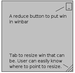
First of all, I think that quite all the windows should be minimizables, and some others resizables. I've seen there's already work done on resizing, and I hope Doener, Elven, and I will finish that. But as for now, I thought that every window, that could be resized, should be painted with a kind of grip bottom right.
A sprite for that had been done by elven for the grip, and the minimize or close top-right thing could be simply a button. Users will be able to see with these where to point their mouse in order to minimize or where to resize, this would hint the users how to do things easily.
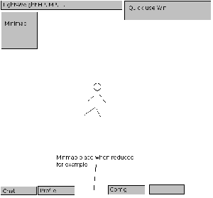
Second thing, where would go minimized (or closed) windows ?
Well, a space should be reserved for minimized windows that could be represented like buttons on the bottom side of the screen. When clicking that button, you make the window appear again, and the button disappears. Easy to understand and handle, user side. I think the minimap,and the chat should be minimizable, too. Elven had a good idea about nicer buttons than normal ones about this kind of "taskbar". Maybe work on a image_button class should be done..
Now about status window:
Lot of people think it takes too much space and I must say it's true. That's why I thought a light-weight version of it would be nicer while the rest of the stats could be grouped in what I called the profile window. But, for now, that window could show what's the more used, i mean 90 % of the time, for instance, HP, MP, XP, and money.
Some users also complained about the fact that while you're in battle, it's really hard to heal with potions because the inventory win takes place too and has no shortcuts.
I think that a quick-use inventory win should be present too in the screen, proposing 3 or 4 usable-only items whith each a shortcut like Ctrl+1 for the first to use, etc..., separated from the inventory win of course, like the equip one. Maybe we could reserve the last four inventory spaces server side for that or something like.
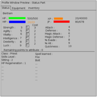
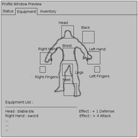
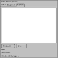
Now, for the big part: I really think that we should make a fusion of all the main stats of direct character related wins, that i called the profile window. That's why I made those screenshots to show what we could do to ease the player handling of many things about his/her character.
In the first part, we can see that three or four wins could be condensed in one "tab". By tab, I mean we could use buttons. The one active should be disabled to show that we can't click on it, and then make the user understand we're on it. Clicking on other buttons would simply change the tab and then change the information shown. So in the Status tab, we could show what we already show today in top right of the screen, plus stats and buttons to update them, also their consequences on the caracteristics of the character : Attack, Defense, ... Under that, Skills, and other class things could be easily shown. The goal is to group things of the same type in one screen.
The second and third part are the equip and inventory part as we know it, but with improvements; The equipment should be nicer and display a list of the effects of all equipped items.
The third one is the inventory exactly as we know it, but with the effect line, that will have to display the effect description on caracteristics. We should separate effect description and description itself, as the first thing we want to know is how many points we earn in defense before knowing a miner hat is ... a miner hat. :)
Momotaro's Example
For now just the concept picture:
Note how I forgot to mention the radar map. It should probably go in the Player info window, compacting the info inthere somwhat.
Player Doll could be made as an expansion of Player info (ie click (somewhere) in player info to transform player info into player doll, with stats). Then again, that could be left for a second GUI type.
--Momotaro 09:46, 28 Jun 2005 (PDT)
Development of Specific GUI elements
New buy dialog
Buying items is cumbersome at the moment and only possible with the mouse. When you have a lot of money, it can be impossible to buy a single item. Also, each time you buy something, the dialog closes and you have to start over to buy another thing. Key differences between the new buy dialog and the current buy dialog are:
- No amount slider. The selection of amount is done using a quantity dialog that pops up after you have selected which item you'd like to buy. The dialog shows the total amount of money it'll cost and allows you to change the amount of items conveniently with both keyboard and mouse.
- Integration of talk dialog with choosing whether to buy or sell.' This allows the shopkeeper to make remarks as part of showing the player the option to buy or sell. Also the shopkeeper could have additional options available, for example maybe he has some quests for you. It is also part of more generic system to allow the player to make choices during dialogs.
- No buttons. The OK and Cancel buttons were removed. Selecting an item could be done by clicking it, while getting information could be done by hovering over it. There is no need to first click it and then click OK. The same goes for selecting the BUY or SELL option. Right clicking the dialog would cancel.
- Type ahead find/search filter. This is actually meant to be global functionality in any list. Especially when the list contains a large amount of items and the user knowns the name of the item he's looking for, this can significantly reduce search time.
- Item information in separate window. This separate window can easily show detailed information about an item and grow as necessary. Better compared to the name and description currently shown in the buy dialog which often do not fit and that's too little information anyway.
- Return to item selection after buying items. This allows you to easily continue your buying session to buy more stuff.
- Shows item icons and aligned item cost. The cost of each item is aligned to the right, and showing the icons will help in recognizing the items.
Alternative to the buy / Sell dialog
After reading the previous lines, users comments and a lot more of else, I thought about an alternative of the buy/Sell Dialog that would be more integrated, and more usable with keyboard, without many pop-ups, and bubbles, as the screen already seems to be full to me. Not to criticize the previous work, but still there is a different point of view :
I think we could use tab in Buy/Sell win and then make it one unique win. Also, a balance system would be great : the balance shows your money plus what you're selling minus what you're buying ; It helps a lot when at the shop. Then, we should be able to move from buy to sell dialog and vice-vera, keeping in memory what we're doing until we push 'Cancel' or 'Agree', that apply all the changes to inventory and money.
We don't need the new server for that because we can get the list of what is sold and create the window after that. At agree time, we buy what the user wanted to buy and sell what he wanted to sell with correct network requests. The name and the effect should be shown every line because that's what everyone wants to know first and the description should be displayed at the bottom, with a click on the item image, or the line.
The thing between the minus and plus button should be an edit box, so that we can specify a value, that would be corrected at leaving the edition. Also, the ugly thing I did just under the edit boxe is a slider, that should be shown only for selling, as we know the max of items the character has. This could help set quickly an approximate number to sell.
Unsure for now which type is best, see this article for a description of several options.
GUI development relating to controls
Redesigning for better keyboard input
The point of these redesigns is mostly to allow for much better keyboard input, because at the moment keyboard GUI input is severely lacking or in some cases completely absent. They are also meant to reduce the complexity of the dialogs and to simplify mouse input at the same time. For keyboard input, the GUI is based around the following (prerably configurable) set of keys:
- Select - A key to select options / confirm actions (default: ENTER or CTRL)
- Cancel - A key to cancel actions / close dialogs (default: ESC or ALT)
- Mode/Switch - A key to change mode, for example whether items are shown in a list or a grid.
- 0-9 - Number keys, can in some cases be used directly to change amounts, together with backspace.
- A-Z - Alphabet, can be used for a type-ahead find or search filter.
My 2 cents --ElvenProgrammer 23:15, 15 Jul 2005 (CEST)
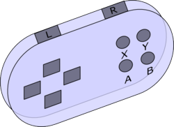
I guess the best effort should be in supporting GUI input from a joypad. Having dialogs fully functional using a joypad means no problem to extend them to be accessed by keyboard or by mouse. As in the sketch, I will suppose having a joypad with at least 6 buttons (we won't support less).
- 4 directional keys - Up/Left/Down/Right
- Confirm button - Y (Yes)
- Cancel button - X (eXit)
- 2 scroll buttons - L & R (Left & Right)
- Special buttons - A & B reserved for special/later use
Following this model we could be able to manage a variety of dialogs: let's think for example that all the dialogs have this structure: input box, action button, cancel button.
Input box It could be something like a list of options, a table of options or an integer input box (of course text input boxes are supported only by keyboard). You can browse options with joypad by using directional keys (or L & R for faster scroll); with keyboard by using directional keys (or PgUp & PgDown for faster scroll); with mouse using scrollbars (or mouse wheel)and selecting with left mouse button. In case of integer input box you can use Up(Right)/Up(Right)/Click on dialog up button to increase amount by 1 unit, respectively for joypad/keyboard/mouse, and act in a similar way to decrease. L&R/PgUp&PgDown/Mouse wheel could be used for increments/decrements of 10 units.
Action button In the case of a list, it chooses the selected option. In the case of a table (for example inventory) executes the default action (brings up a popup menu: equip, drop, use, hide throw, melt, burn, eat or whatever else). In an input box, confirm selected quantity. In a NPC's text dialog for example is the 'Next' button. It's activated by the 'Confirm button' on joypad. On keyboard it could be easily mapped to 'Ctrl' or an user defined key. The same could be reached by left clicking on it with mouse.
Cancel button Cancel current operation or closes the current dialog. Using the 'Cancel button' on joypad, backspace (or a user defined key) on keyboard, or left clicking on it with mouse.
Designing all the GUI dialogs to accept this model will lead to an easy way of rebinding keys, where no more than 6 keys should be defined. Of course in game input is another matter...
